
If you’ve read some of my previous posts you may have noticed that I’m fascinated by maps and the data that’s used to make them. I even went to so far as to use a bike and a GPS tracker to write my name across all of downtown Bangkok. But recently I stumbled on an amazing project by artist Eric Fischer that used maps and data in such a unique way that I just had to dive in and explore to see what I could learn about Bangkok.
For the past few years, Fischer has been combining data from Twitter and overlaying it on maps created with Mapbox. By doing this, he created a map of the entire world that shows the location of 6.3 billion geotagged tweets over 3.5 years. It’s a really cool way to visualize a city’s layout using nothing but pure, raw data.
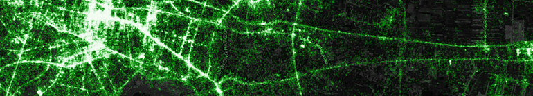
For instance, here’s a detail of his map centered on Bangkok:
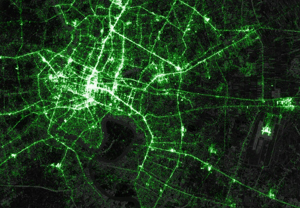
Just like The Matrix! But while cool, it’s a bit much to take in.
That makes an impressive picture, but Fischer recently took the data one step further: by analyzing the length of time a tweeter spent in a single city, he was able to roughly determine if they were a tourist (less than one month), or if they were a local (more than one month). For this new map, blue dots represent tweets by locals, and red dots represent tweets by tourists. It’s a really impressive achievement. So, I decided to see what we could find out about Bangkok.
Plus, I added a cool new feature – an image slider that lets you overlay the dots on top of a real Google Map.
First, an image of the city zoomed way out. Move your mouse over the image to compare the two.
On the image above, you can see that red-dot tourists are clustered in a few tell-tale spots, mostly shopping malls along the BTS lines: Siam Square, Central World, Pantip Plaza & Platinum Mall, Terminal 21, and Nana Plaza. There are also nice little groupings along upper Silom (Pat Pong), Victory Monument, Asiatique, Khao San Road, and of course, Sirocco with its million-dollar view. Surprisingly, there’s very few tourist dots at the Grand Palace. Way on the northwest corner of the image, Central Pinklao also has a few tourist dots, for whatever reason.
Next, let’s take a closer look at downtown.
Not a lot new here – Siam Square and Central World are where most of Bangkok tweets from, apparently. But you can also see some tourists tweeting from around Hualumphong train station and Chinatown, as well as Klong San Market, just across the river.
Next, what about Thonburi and the west side of the river?
First of all, this side of the river’s an abandoned wasteland, tweet-wise. The cluster of tweets just above the center of the map is Mahidol University, but I was surprised that Phuttamonton, the huge, beautiful park just south of Mahidol, doesn’t have more tweets. Further west you have a cluster of tweets from Nakhon Pathom, with its famous Phra Pathom Chedi and beautiful Sanam Chandra Palace.
Next let’s go to Suvarnabhumi Airport.
You can clearly see the layout of the H-shaped terminal, and the huge number of tourist tweets are no surprise – in 2012 the airport was the most Instagrammed place in the world. There’s also a lot of local tweets northeast of the airport, at King Mongkut’s Institute of Technology.
How about the area east of Bearing?
Nothing really amazing here – clusters of tweets from BITEC convention center and Central Bangna. The big cluster of tourist dots on the lower right of the image is Mega Bangna and IKEA. Not sure why tourists would go to IKEA. The cluster of dots north of IKEA is Ramkamhaeng University’s Bangna campus.
Finally, let’s take a closer look at the area around the Grand Palace.
On closer zoom, you can actually see a fair number of dots in the Grand Palace and Wat Po, but far less than I expected to see. Khao San Road and Soi Rambutree have mostly red dots, and there are plenty of tweets being sent from Ratchadamnoen Road and around the Democracy Monument. There’s also a huge cluster of tweets across the river. This is Wang Lang Market, mostly popular with Thais, but interestingly also where Siriraj Hospital is and where HM The King is currently staying – a popular site for Thais to visit and offer their well-wishes.
So there we go, a view of Bangkok based purely on tweet data. You can also read more of Fischer’s interesting but very technical blog post here.
Damn – super interesting stuff Greg!
Really impressed how you had the maps change as you scroll over them.
Keep up the great work and blogging.
Thanks.
Scott
Thanks Scott, I think it’s a really cool way to look at maps, and entire cities, using just data. We’re closer to the Matrix than ever now…
Very interesting! Apparently Twitter is a medium for the bored – waiting for a plane departure and stuck in a traffic jam. It’s quite obvious that a lot of locals tweet while they’re driving (or riding as a passenger). I’ll have to check the Seoul area pronto!
Thanks Oliver, you’re probably right – stuck in a traffic jam is where people tweet. And, of course, shopping malls. “Oooh, look, a new Krispy Kreme!” *click*
Wow this is extremely impressive and amazing stuff Greg! What tools are you using to make the map slider/overlay?
Very useful man.
Thanks Shayan. It was just a plugin I bought from CodeCanyon, only a few hundred baht but it works really well. Now I just need to find another use for it to make it worthwhile. 🙂
Interesting stuff !
Perhaps those red dots at Ikea are visitors from inside Thailand ? apparently it’s quite common for thais to come down from upcountry and load up with new furniture/whatnots that they cannot get at home. They can stuff the pickup full of flat packs !
Thanks Mike, that’s a really good point – lots of Thai tourists in Bangkok as well, and a big swanky new store like Ikea would be almost a tourist attraction haha.
Expats surely do love to find their ikea everywhere!
Very nice work with the image slider! I am always amazed with maps like these. Thanks for sharing.
Thanks Chris! It’s a cool little plugin with limited use, but I have an upcoming post that will be pretty awesome. Stay tuned!
Nice work on this post, and great website.
Thanks JMD, glad you enjoyed it.